This Blog belongs to a dear friend of mine:
http://zinnfandel.wordpress.com/
it's about her work, we learn Animation
together, I'm into Traditional Animation
and she's really into Stop-Motion
and Computer Games and naturally,
the combination of them both.
She takes what she does really seriously
so she just got back from Germany.
She went on a business tour to Gamecon
the Computer Game Conference,
she played Diablo III before us all !
I should adopt her seriousness about
what I do, I wish I would go to some
Film Festival but I'll save that for when
I'll compete in one, hopefully...
Anyway, check out her Blog, it's worth it !
My Blog about all I have to say about Art, Design & Animation.
Monday, August 30, 2010
Sunday, August 29, 2010
Be Less Racist !
Here's a Short Film by UPA from 1946 basically
telling us to BE LESS RACIST !
The thing that bothered me is that they're saying
that in the future the world will be a global
village so you shouldn't be racist, and it came true,
we're now IN THE FUTURE and the world IS a
global village but yet, some places are still very
racist, and I don't mean only in Israel when
the Jewish and the Arabs can't get along,
there ARE some places in the US that you can't
go if you're black, I won't name states
but I'll say this,
RACISTS - SHAME ON YOU !
Saturday, August 28, 2010
Lex Luther & Joker Comics...
A little something I found in "io9" today,
I really liked it, it's so true to the characters,
and I say that as an old comic-book fan
who used to collect comics for fun
when I was a teenager.
Lex Luther and the Joker were kind of my favorite
DC Comics characters, both great villains in their
own way and both more interesting than their
so-called "Heroes" (Superman & Batman),
well, the comics:
Friday, August 27, 2010
My Own Student Film on Youtube
I finally did it, today I uploaded my Third Year Student Film
to YouTube, a process that takes Hours, by the way,
well, here it is, "Goose Liver":
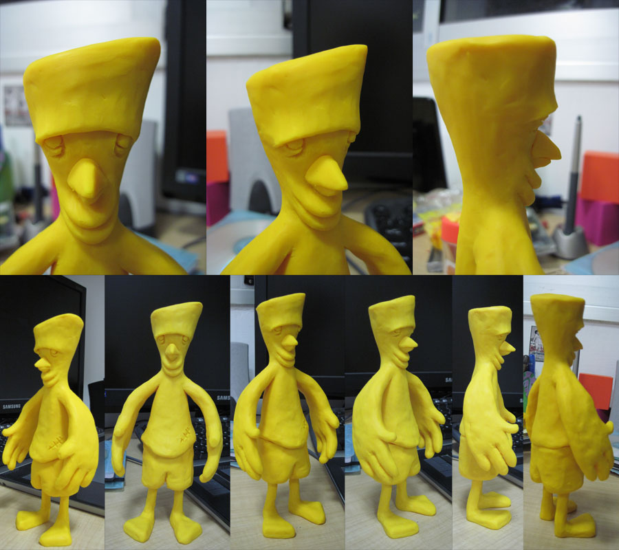
I already uploaded my sculpture reference to my Deviant Art page,
there been a few design changes brought up by my Most Talented
Design Teacher: Michael Faust, well, here's the sculpture reference:
to YouTube, a process that takes Hours, by the way,
well, here it is, "Goose Liver":
I already uploaded my sculpture reference to my Deviant Art page,
there been a few design changes brought up by my Most Talented
Design Teacher: Michael Faust, well, here's the sculpture reference:
Thursday, August 26, 2010
Making Fun of Movement...
This is another short film from the 1950s,
it's about a dog in search for food that
becomes the C.E.O of a winner factory
in order to get some food.
what I like about this one is that you can actually
see what Genndy Tartakovsky, the man behind
Dexter's Laboratory, meant when he said he was
"Making fun of movement, NOT copying it",
the movement in this short is pretty, it's functional
and it's way funnier than a realistic movement,
anyway, the idea of this short is great as well.
Wednesday, August 25, 2010
Funny Picture by a Friend

picture was taken by a friend of mine, Itamar Keren
I really liked the picture and the pose, done with
a real-size Kermit doll that he has, for some reason.
Just a funny picture.
Tuesday, August 24, 2010
Where does Pixar get their Ideas for Short Films ?
I've just seen this film the other day, it's from UPA
and it's been directed by John Hubley in 1949,
I'm merely suggesting that Pixar, or at least their
Short Films Department, seen this film and got
influenced by it.
I don't think that the Pixar Directors consciously stole
ideas from some old UPA cartoon, but the similarities
are more than just coincidences.
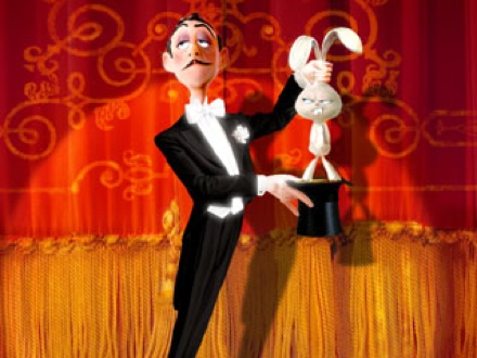
now, besides the fun in this movie, they're couple of things that ring a bell
here, first the Crow takes a magic wand that makes bunnies appear
everywhere, if it doesn't sounds familiar yet, so the name of the original
owner of the wand, the magician "Presto", ring a bell ?
(check out the in-film poster on the wall "Presto")
.jpg)
.jpg)

and it's been directed by John Hubley in 1949,
I'm merely suggesting that Pixar, or at least their
Short Films Department, seen this film and got
influenced by it.
I don't think that the Pixar Directors consciously stole
ideas from some old UPA cartoon, but the similarities
are more than just coincidences.
now, besides the fun in this movie, they're couple of things that ring a bell
here, first the Crow takes a magic wand that makes bunnies appear
everywhere, if it doesn't sounds familiar yet, so the name of the original
owner of the wand, the magician "Presto", ring a bell ?
(check out the in-film poster on the wall "Presto")
.jpg)
And if that's not enough, at the end when the Fox can't conduct his band
anymore and realize he has to give up his fame, the Crow comes helping
him wearing his All-in-One musical instruments suit, that kinda looks
familiar, don't you think ?
.jpg)
Monday, August 23, 2010
Nice Coraline Poster

well, just a poster I found online, I really liked it because
I feel it says it all without being too out there, I mean,
if I saw this poster BEFORE I've seen the movie,
I would be curious about the character in the back
because the girl seems not too sure about her,
but AFTER the movie I would get that the girl is
scared of her but also kinda fond of her, because
it's her mother (well, other mother, whatever...)
anyway, I also like the design of it, it's not too
childish for an animated film but not too scary
as well, it's just in the middle ground that says
"it's animated and it's ALSO for kids, NOT just for kids"
Sunday, August 22, 2010
More 1950s Cartoon Design...
Here's another short film from about 1958 from TerryToons,
I really like the design in this one:
Notice how functional the character design is, Sidney (the Elephant) is sucking
his own Trunk when his scared and when needed his Ears become Hands,
and the part I like the most, when he screams, his hole body becomes his
Mouth, even so you don't see he's breaking out of character, you always
see the same cartoon elephant.
Notice that even in this kind of simplicity, when he talks he moves his whole
body and not only his mouth and that gives character and credibility to the character.
Besides that, notice that the Elephant is BLUE, he's not grey like most elephants,
you can clearly see it in the end, when he stands near the grey Rhino.
The color of the character makes him POP through the other characters because
he's the only blue character there, most characters are yellow, grey or green.
Also the backgrounds are mostly yellow, grey (or dark gray) or green but notice
the different shades of the background colors, it's very smart color picking.
The backgrounds are very smart, not only color-wise, their design is very functional,
I know quite a few people who would lose their point of interest (the Character) in
a jungle background, but because of the jungle's flatness and settle hints for
trees (instead of realistic ones), the Characters just POP out, notice that even
with a almost Black background in the beginning you can see the character clearly,
even when its Lines get lost in the Black of the Background.
and the last thing I have to say is about the usage of the foreground in the backgrounds,
the backgrounds seems kind of flat because the use of only two colors mostly, one for
the fill and background and one for the lines, and yet the usage of Foregrounds gives us
all the depth we need and lack of in color.
Saturday, August 21, 2010
1950's Modern Character Design
This is my new Blog about all I have to say,
and this time, about Character Design in
1950's Cartoons, I'll post more about this
subject, but for now, I wanted to show this
Short Film from Disney (1953) by Ward Kimball:
I love the design of the Cavemen in this film, their animation is so cheap
but yet so rich, I specially love the one with the Horn and the one
with the Drum...
the Owl seems too Disney for me, like they did it like they always do
and than just erased the lines instead of really design it as a modern
cartoon character.
That's all I have to say for now,
see you next post >>
Subscribe to:
Posts (Atom)